| SkullandBonesSkateboards.com Forum Index » SKATEBOARD ART » Evolution of skeleton Mountie graphic |
|
Page 1 of 2 Goto page 1, 2 Next |
|
| Author |
Message |
| Jedi_deangelis |
 Posted: Fri May 27, 2011 5:48 pm Posted: Fri May 27, 2011 5:48 pm |
 |
|
|
Joined: 08 Nov 2001
Posts: 2830
Location: Kingston, ON
|
Since I already showed the evolution of the Crashed Alien graphic, I thought I'd show the evolution of the Skeleton Mountie graphic that'll be re-issued this year.
Here's the initial sketch that Jason had to work with. You can see he's started to do some line work. He added the medal on his chest that I thought was a rad little touch.

The part I wanted tweaked was the nasal cavity. Here in this version it looks a little like it's just cut out of the skull without any bridge to the nose. (see the closeup)

Here's more progress. Super awesome wrinkles and folds in the uniform.

Here in the closeup you can see what a differece the change in the nose made. The medal has also been changed into one of hte Broken logos. A nice little touch.


Here's the first little bit of colour and the logo on the tail. THe logo was eventually changed. There's also the BRKN logo on the horses' chest which I thought was an awesome touch.
 |
|
|
| Back to top |
   
|
|
|
| strohsbro2 |
| Posted: Fri May 27, 2011 6:10 pm |
|
|
|
Joined: 06 Jan 2003
Posts: 15037
Location: Indiana
|
| Awesome |
_________________
All your Tony Hawk boards belong to me! |
|
| Back to top |

|
| Jedi_deangelis |
| Posted: Fri May 27, 2011 6:22 pm |
|
|
|
Joined: 08 Nov 2001
Posts: 2830
Location: Kingston, ON
|
Here's more colour. It's just the basics at this point and a bit flat.

The colour in the flag really emphasized the swirly tails that would eventually be changed.

Here the idea of the horse kicking up a cloud of dust is added in. It looks a bit too much like dirty soap bubbles at this stage but evolves as you'll see.
 |
|
|
| Back to top |
|
|
|
| mosu101 |
| Posted: Fri May 27, 2011 7:12 pm |
|
|
ORDER OF THE SKULL

Joined: 08 Aug 2006
Posts: 5086
Location: Australia
|
why isnt the horse in Skeleton mode?
just asking... rad graphic none the less |
_________________
so upset photobucket took my avatar... |
|
| Back to top |
|
| RipGrip |
| Posted: Fri May 27, 2011 10:46 pm |
|
|
 Joined: 24 Jul 2008
Posts: 302
Location: Armpit of America
Joined: 24 Jul 2008
Posts: 302
Location: Armpit of America
|
|
| Back to top |
|
| Jedi_deangelis |
| Posted: Sat May 28, 2011 6:43 am |
|
|
|
Joined: 08 Nov 2001
Posts: 2830
Location: Kingston, ON
|
Never thought of the horse being in skeleton mode. Might have given off too much of a Ghostrider vibe if it did.
OK... so continuing along.
Here you see the first logo that works but it's a bit small.

bigger logo. Horse is now black which is rad. More depth with the colour layers.

Trees have been added to the background and the "soapiness" has been diminished.
 |
|
|
| Back to top |
|
|
|
| Jedi_deangelis |
| Posted: Sat May 28, 2011 6:54 am |
|
|
|
Joined: 08 Nov 2001
Posts: 2830
Location: Kingston, ON
|
Now here we're getting into some problems. First attempt at a sky didn't work with purple and the flag is lookn' pretty messed up. There's even more detail added with more colour layers. The horses' mane is blue. Didn't dig the ghostly glow around the mountie either. The bottom half is pretty well set... the top however needed some work.

Here the sky is pulled out. Mountains were added. The amount of dust has been significantly decreased and I think looks a lot better. The flag still wasn't working though. The last red panel was too long and the maple leaf seemed skewed.

So the last red panel has been made smaller but maybe too small. The sky is purple and just not working. The mountains are also brown which I thought could be changed.
 |
|
|
| Back to top |
|
| Jedi_deangelis |
| Posted: Sat May 28, 2011 7:02 am |
|
|
|
Joined: 08 Nov 2001
Posts: 2830
Location: Kingston, ON
|
Jason came up with a REALLY nice shade of blue for the sky which worked. The red panel was elongated but was still too long ... so with my 5 year old crayon photoshop skills I tried to show him what I was looking for. Shortened the last red panel of the flag and straightened out the maple leaf. Jason also changed the horses' mane from blue to grey which I think looks better. The mountains are grey and the soap bubble effect is dramatically decreased.

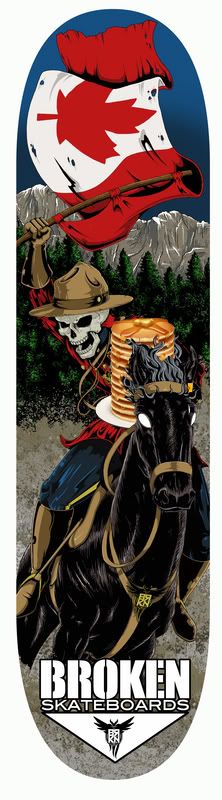
And here we have the final version!  Probably the fastest selling deck Broken has ever released and possibly the most popular on SnB. (close tie with the Polar Natas). Probably the fastest selling deck Broken has ever released and possibly the most popular on SnB. (close tie with the Polar Natas).
Funny when I look at it now; the last little detail we slaved over was the colour of the cloth on the medal to make it stand out more on the mounties' chest. It's amazing how much time and detail goes into one of these graphics!

This board is available again this year if anybody would like one. I only made 25 and they're $45 each plus shipping. Let me know if you want one and thank you to all of you who've supported Broken through all the years. |
|
|
| Back to top |
|
| krayola |
| Posted: Sat May 28, 2011 8:50 am |
|
|
 ORDER OF THE SKULL
Joined: 11 Feb 2007
Posts: 15449
Location: R'lyeh 47°9′S 126°43′W / 47.15°S 126.717°W / -47.15; -126.717
|
When you going to show the evolution of the Luke Skywalker and a Ton-Ton, Yoda, C3P0 & R2D2 with pictures of you opening up a books, scanning artwork and placing Broken logos in Star Wars font on the art.
Because this really is fascinating and I want to learn how to do that because I don't know how to do that. |
_________________
XXX UPDATES, PLEASE READ
Flikr photo archive |
|
| Back to top |
|
|
|
| adamcreative |
| Posted: Sat May 28, 2011 11:48 am |
|
|
ORDER OF THE SKULL
Joined: 09 Nov 2008
Posts: 2932
Location: SoCal
|
Kray with the dig!
 
I do like the evolution of the Mountie, fun to see the progression.
And I dig my Broken TaunTaun....
The others don't work quite as well for me.
But still, great efforts and a definite overall thumbs-up. 
How about adding a stack of pancakes in there??
You probably won't do that.
But I will.
The syrup is Maple from Canadia.
The bottom logo is too heavy for me also, seriously. Perhaps remove entirely? I like the subtlety of it being incorporated into the graphic already; or at least smaller like the earlier versions.
And I'm not sure if you're done with the leaf on the flag yet, but it looks a little flat in comparison. Said with mad respect, just tryin to help. |
_________________
WANTED:
NOS Schmitt Howell Pyramid
NOS Powell Cab Full Dragon (silver)
Artsy Slicks, K. Haring, Mullen
CONTACT: [email protected] |
|
| Back to top |
|
|