| SkullandBonesSkateboards.com Forum Index » SKATEBOARD ART » critique... |
|
Page 1 of 1 |
|
| Author |
Message |
| oasis |
 Posted: Thu Sep 01, 2005 7:50 pm Posted: Thu Sep 01, 2005 7:50 pm |
 |
|
 Joined: 28 Jun 2003
Posts: 364
Location: Hilo,Hawaii
Joined: 28 Jun 2003
Posts: 364
Location: Hilo,Hawaii
|
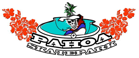
So we're finally going to make a skatepark in this town after about 10 years of lobbying and they need a shirt design.
I think I am either going to add more detail to the bowl or take away some detail from the skull. And I'm still working on the text. Help me out and let me knw what you think. thanks
 |
|
|
| Back to top |
    
|
|
|
| SkaterX |
| Posted: Thu Sep 01, 2005 8:03 pm |
|
|
 Joined: 28 Apr 2005
Posts: 1040
Location: Oztralia
Joined: 28 Apr 2005
Posts: 1040
Location: Oztralia
|
Oasis, I dig the version with the flowers, for some reason it works well with the overall shape,,'
I would consider maybe repositing the guys arm, it`s kinda taking away from the skull, pineapple thing you`ve got going there...
The skull thing dosen`t look to be part of the same picture though...I`d add moe detail to the bowl, rather than take away from the skull..
Nice though.....I`d wear it... |
|
|
| Back to top |
|
| slob-air |
| Posted: Thu Sep 01, 2005 11:12 pm |
|
|
 Site Admin
Joined: 27 Oct 2001
Posts: 63531
Location: S&B HQ
Site Admin
Joined: 27 Oct 2001
Posts: 63531
Location: S&B HQ
|
| That skull reminds me of a Deathbox deck (I think it was deathbox... maybe BDS?). |
_________________
>>>>>Get your S&B Stickers here<<<<< |
|
| Back to top |
|
|
|
| ThrashCan |
| Posted: Thu Sep 01, 2005 11:27 pm |
|
|
 Joined: 16 Mar 2004
Posts: 1331
Joined: 16 Mar 2004
Posts: 1331
|
I like the middle layout with the flowers.
I think the bowl looks fine its just the body and the skull look like they were drawn by two different people. |
|
|
| Back to top |
|
| oasis |
| Posted: Fri Sep 02, 2005 12:54 am |
|
|
|
Joined: 28 Jun 2003
Posts: 364
Location: Hilo,Hawaii
|
it's not really done. yeah the whole boddy is pretty illustrative. thick lines. no detail. I guess I'll jsut throw some crosshatches for folds etc. and tone the detail on the skull down a lil.
you think i should make the arms bones? |
|
|
| Back to top |
|
| Smakutus |
| Posted: Fri Sep 02, 2005 2:41 am |
|
|
|
Joined: 10 Dec 2001
Posts: 2932
Location: Meechigan.. Collect and Destroy!
|
I'd bring the guy up a bit more in the bowl.. Show a bit of truck on the coping etc.. The wheel doesn't look right. I like the flowers. When you print them up I'll buy one from you.
Outt..
Jeff. |
_________________
"what the heck you talking about i sent you the money weeks ago,and you still gaveme a negative feedback,and top it off never sent me the tape,its ebayers like you that screw people,Thanks for messing up my ratings jerk.."
A. Fuckingkissfan. |
|
| Back to top |

|
|
|
| brett |
| Posted: Fri Sep 02, 2005 5:46 am |
|
|
|
Joined: 05 Apr 2003
Posts: 530
Location: new zealand
|
i like this txt style way better than the other.
thought id have a little play
 |
|
|
| Back to top |
|
|