| SkullandBonesSkateboards.com Forum Index » SCREEN PRINTING » New design ideas for 2007 |
|
Page 1 of 1 |
|
| Author |
Message |
| Ceasar13 |
 Posted: Fri May 12, 2006 9:54 pm Posted: Fri May 12, 2006 9:54 pm |
 |
|
 Joined: 21 Sep 2003
Posts: 201
Location: Ory-gun
Joined: 21 Sep 2003
Posts: 201
Location: Ory-gun
|
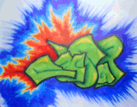
Heres my new graffs I am thinking of for my next run, lemme know what you all think pls.

 |
|
|
| Back to top |
  
|
|
|
| Ceasar13 |
| Posted: Fri May 12, 2006 10:03 pm |
|
|
|
Joined: 21 Sep 2003
Posts: 201
Location: Ory-gun
|
|
| Back to top |
|
| Ceasar13 |
| Posted: Fri May 12, 2006 10:03 pm |
|
|
|
Joined: 21 Sep 2003
Posts: 201
Location: Ory-gun
|
| logic |
Last edited by Ceasar13 on Fri May 12, 2006 10:05 pm; edited 1 time in total |
|
| Back to top |
|
|
|
| Ceasar13 |
| Posted: Fri May 12, 2006 10:04 pm |
|
|
|
Joined: 21 Sep 2003
Posts: 201
Location: Ory-gun
|
|
| Back to top |
|
| Drunk Engine |
| Posted: Sat May 13, 2006 10:02 am |
|
|
 Joined: 11 Jul 2002
Posts: 765
Location: New Jersey!!
Joined: 11 Jul 2002
Posts: 765
Location: New Jersey!!
|
| I like the train deck but the font and color for the logo don't look good, you may want to consider scaling down the size of your logos or even incorporate them into your graphic. Take a subtle approach. |
|
|
| Back to top |

|
| emoxfag |
| Posted: Wed Jul 19, 2006 1:12 am |
|
|
|
Joined: 31 Oct 2005
Posts: 80
|
| try using subtle hues, in the same family as each other. like less intense reds and blues and stuff. |
|
|
| Back to top |
|
|
|
|